• bold
  • brave
  • iconic
  • simple
  • louder
Loaded
2022-2023Website redesign
Inwentury - Become stocktaker

Type

Giant UX/UI redesign of a website for a stock counting service. Including landing page and panels for user, admin, mini-admin, recruiter and payroll manager.

Team

2 UX/UI Designers, Project Manager and 8 programmers

Responsibilites

My responsibilities covered conducting user research, creating wireframes and high-fidelity prototypes of mobile and desktop view, conducting user testing, and delivering the final designs.

Project Summary

This case study covers only landing page and user flows, but this project had many other aspects such as recruiter or payroll panel.

Problem

The Inwentury website had a high bounce rate and low conversion rate. Users were having difficulty navigating the site, finding available job listings in their area, and applying for the jobs.

Solution

The solution was to redesign the website’s user interface and user experience to make it more intuitive and user-friendly. This involved simplifying the navigation, improving the search functionality, prioritizing important information and streamlining the job application process.

Research

Understanding
the user

To gain insights into the needs and pain points of our users, we conducted a survey and in-depth interviews with a subset of users who had previously used our website to search for job opportunities. During the survey and interviews, we asked open-ended questions about their experiences with the website’s job application process, usability, and overall user experience.

What about
competiton?

In addition to understanding our users needs we conducted research on our competitors to gain insights into their user experience, features, and design. We analyzed 5 main competitor websites and identified key features and design elements that we believed would enhance our own website’s user experience.

Research
findings

  • 78% of users had difficulty finding available job listings in their region.
  • 65% of users found the website’s navigation to be overwhelming and confusing.
  • 50% of users reported that the job application process was lengthy and complex.
  • Competitor research showed that other job listing websites offered simpler and more intuitive user experiences.

Design Approach


Sketches


We started with sketches to explore different layout and navigation options. We wanted to create a design that was clean, simple, and easy to use.


Wireframes


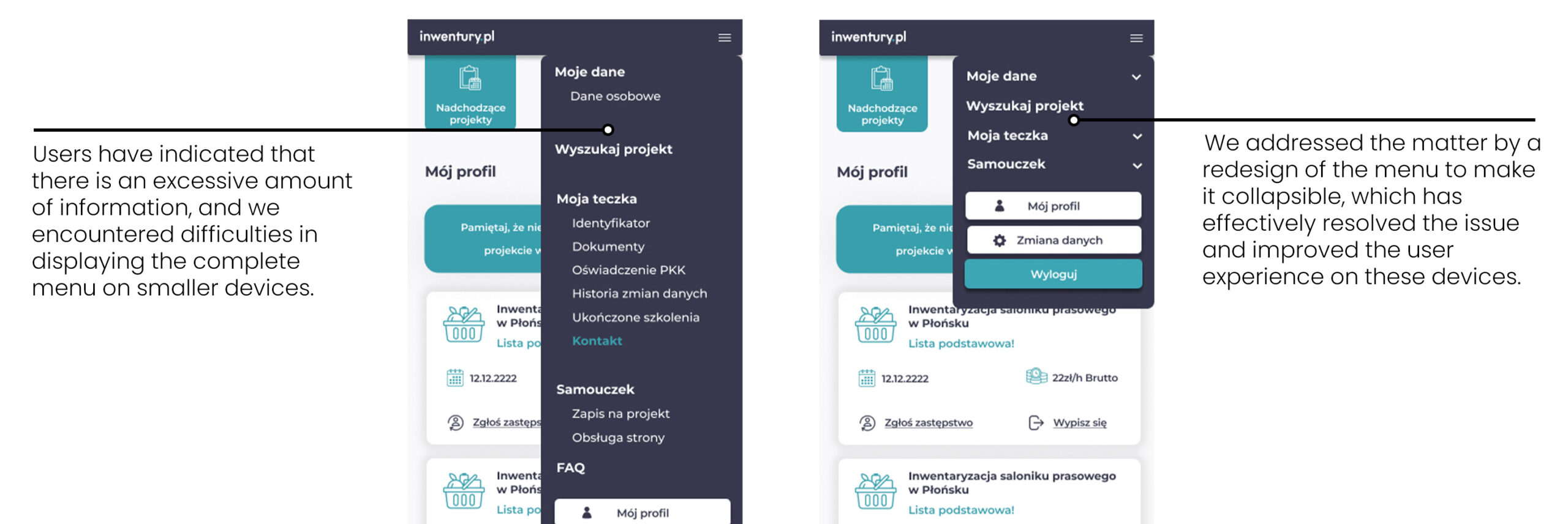
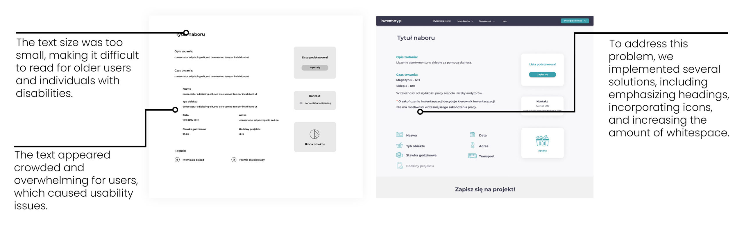
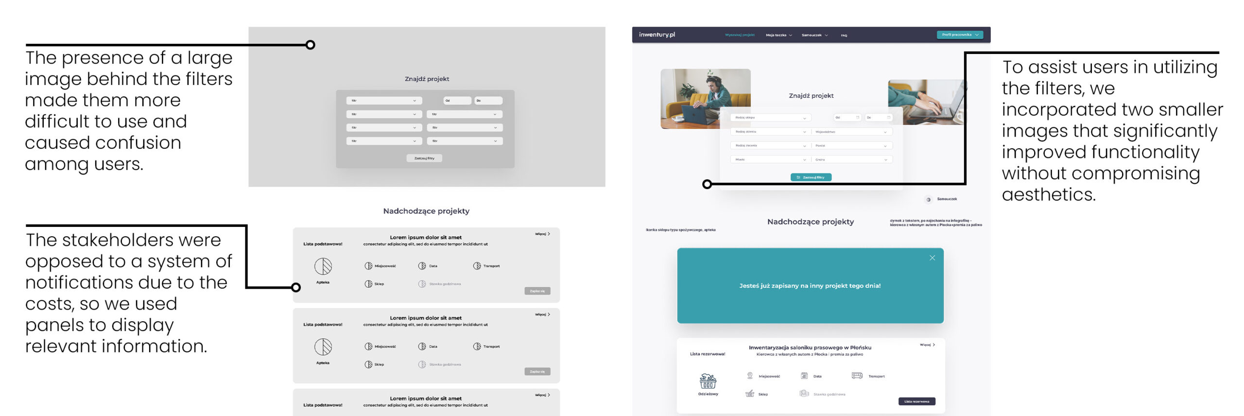
Once we had identified the best layout and navigation options, we created wireframes to flesh out the design and test it with users. The wireframes helped us to identify any issues or problems with the design before we moved on to the high-fidelity prototypes.
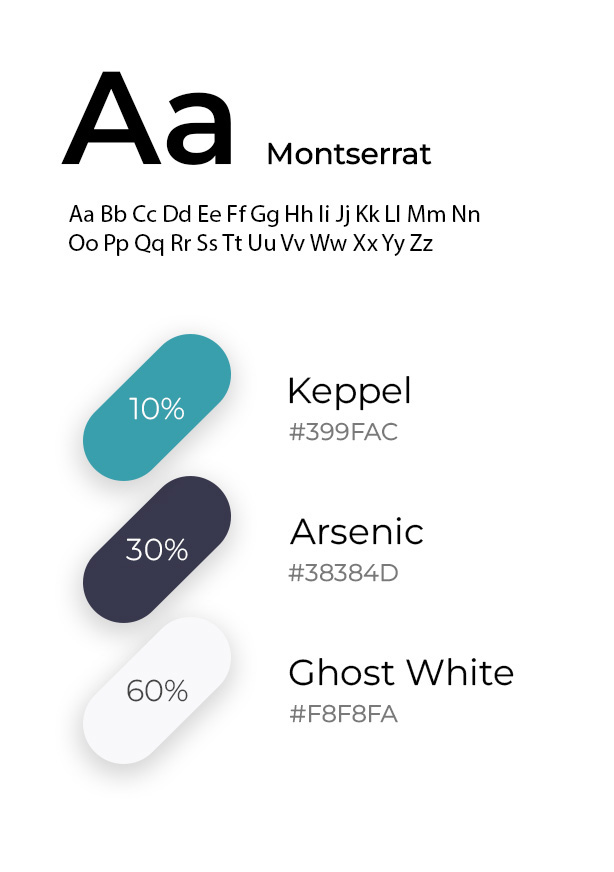

Font & colors


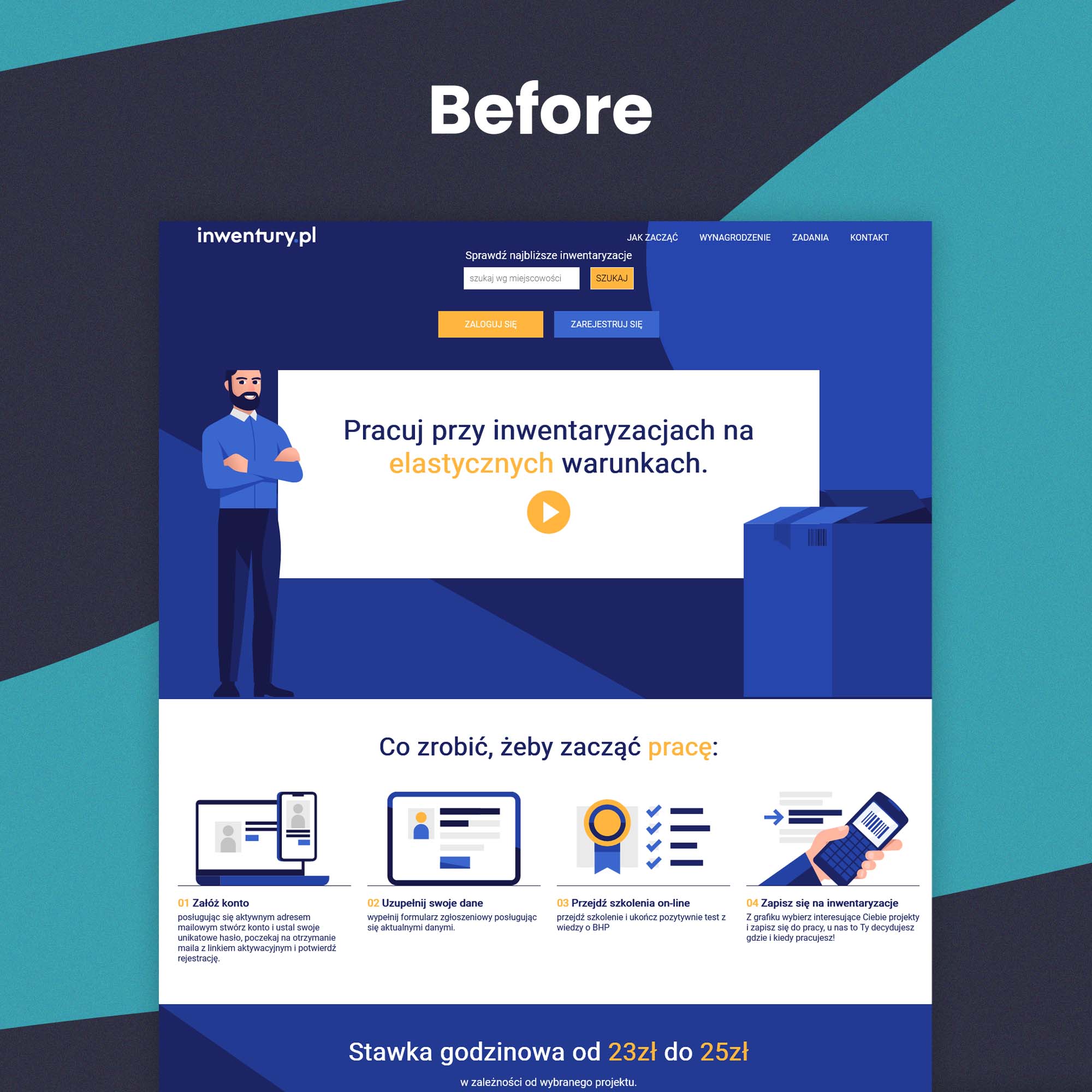
With wireframes completed, it's time to add some personality and character to the design. A careful consideration of the color palette can evoke certain emotions and create a specific mood that aligns with the brand's values and objectives. The font choice is equally important, as it can affect the readability and accessibility of the website or application.

User Testing

We conducted a number of tests with the users on the prototypes to identify any issues or problems with the design. Based on the feedback we received, we improved on the design. These are some of the changes we’ve made.

Final Design

The final design was clean, simple, and intuitive. The navigation was streamlined, the search functionality was prominent and easy to use, and the job application process was straightforward and easy to follow. The impact on the company was significant – estimated bounce rate decreased by 25%, and the conversion rate increased by 20%. Job seekers were happier with the user experience, and as a result, more people were applying for jobs.

2020App design
Foodine - The cooking app