Type
Passion project of an cooking app. Main point of the project was to learn more about user research
Team
UX/UI designer (myself) and a lot of lovely users that were willing to help me during this project
Responsibilites
As the sole UX/UI designer of the project, I was responsible for conducting user research, performing competitive analysis, designing wireframes and prototypes, and testing the designs.
Project Summary
Problem
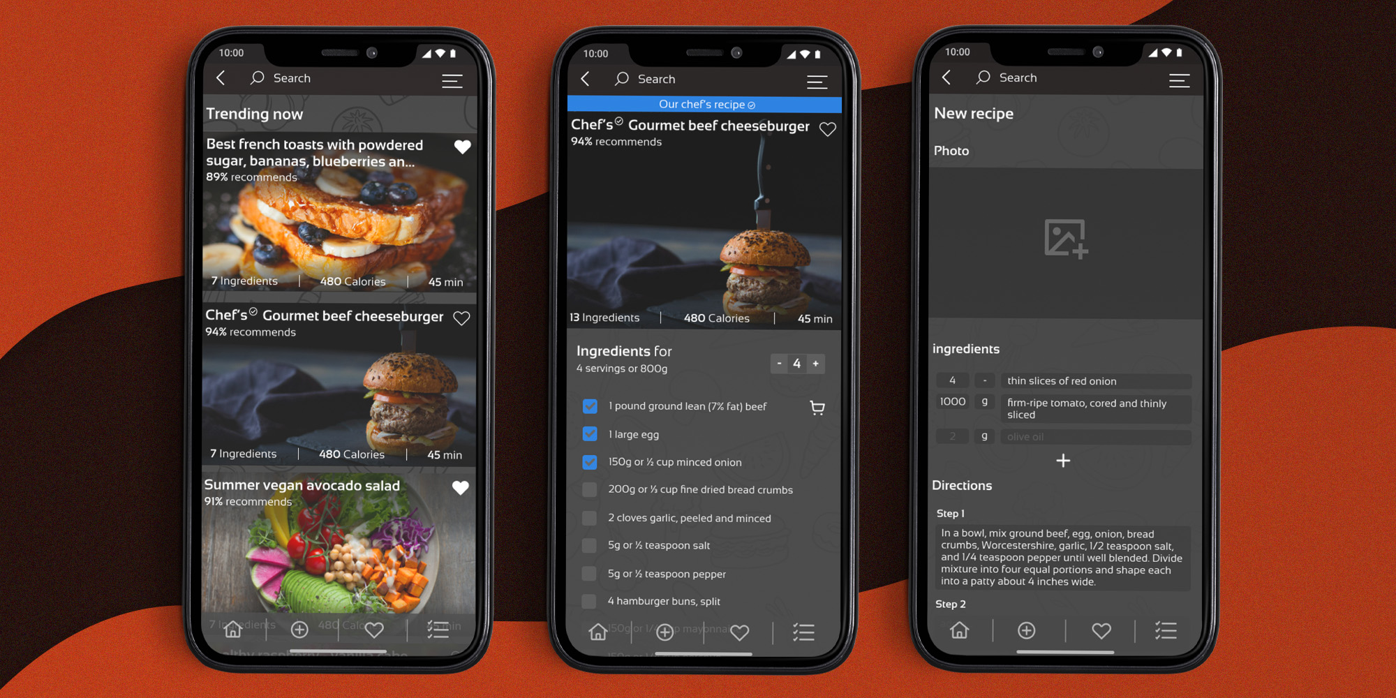
The goal of the project was to design an app that addresses the main discovered pain point – using that people have left in fridge to cook a tasty meal. The challenge was to create an app that was easy to use, engaging, and met the needs of users who want to save money and reduce food waste.
Solution
The solution was to implement a feature in filters that allowed users to enter the ingredients they have on hand and receive recipes that use said ingredients. The app would also suggest recipes based on users’ dietary preferences and food restrictions, which was also a pretty common requirement for users.
Research
Understanding
the user
To gather insights into users’ needs and pain-points, I utilized both surveys and interviews. In total, I spoke with 5 users and received 60 survey responses.
While interviewing, 50% of users reported a need for an app that will help them use up leftovers, and nearly 100% of survey participants agreed this feature would be useful.
Research
findings
To understand the competitive landscape, I performed a competitive analysis on top four most popular apps, such as Tasty. The analysis helped identify the features that were working well in other apps and areas where there was room for improvement. I realized that only app with mentioned feature offered poor UI and awful UX
Key
insights
- Users struggle with using up ingredients before they go bad, leading to wasted food and money.
- Users want an app that can help them create recipes based on what ingredients they have on hand.
- Competitor analysis revealed that the majority of the top cooking apps do not have a strong focus on helping users use up ingredients they already have.
Design Approach
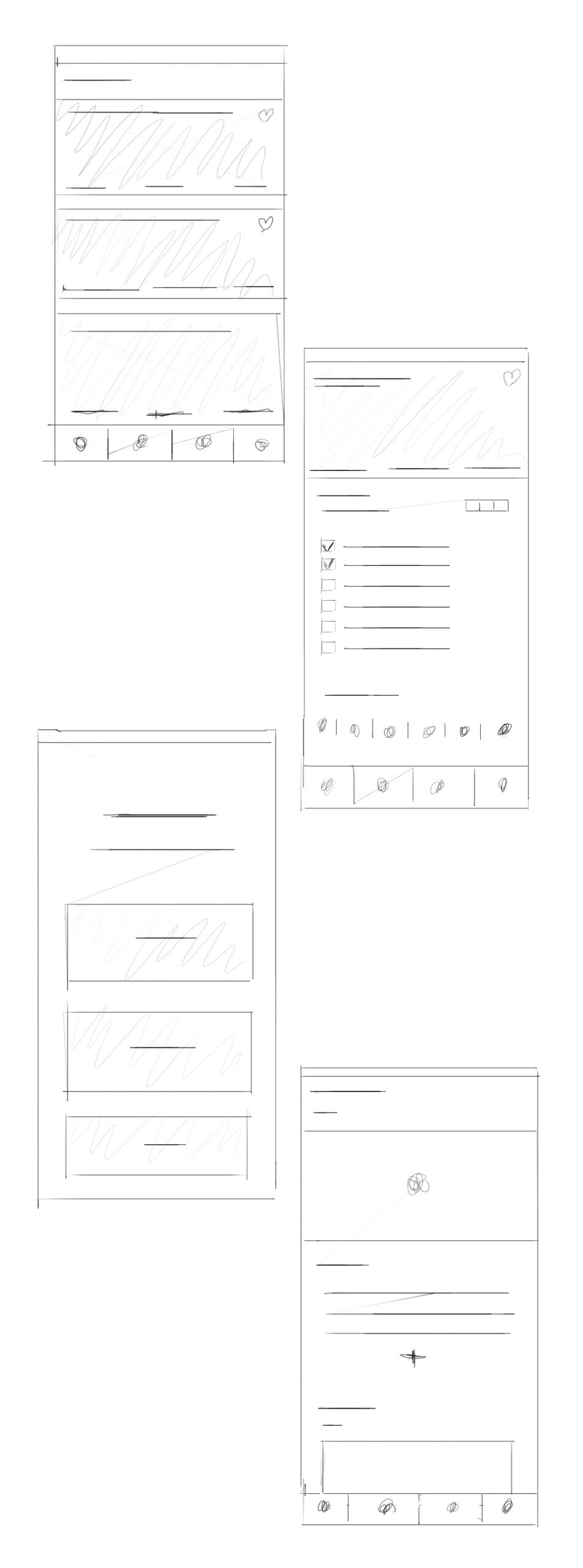
Sketches
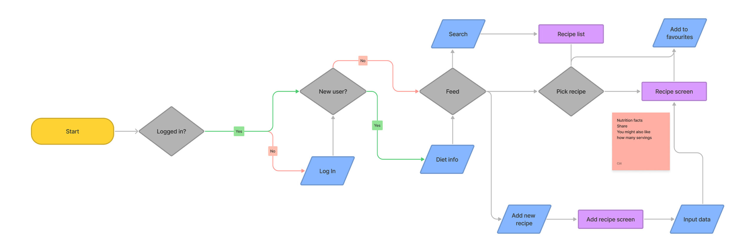
After conducting user research and competitor analysis, the next step was to start ideating and sketching out potential design solutions for the app. As the only UX/UI designer on the project, I took a collaborative approach and worked closely with the users to gather feedback and iterate on the initial sketches.
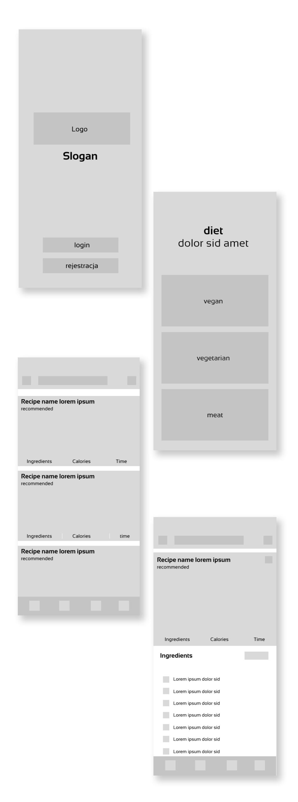
Wireframes
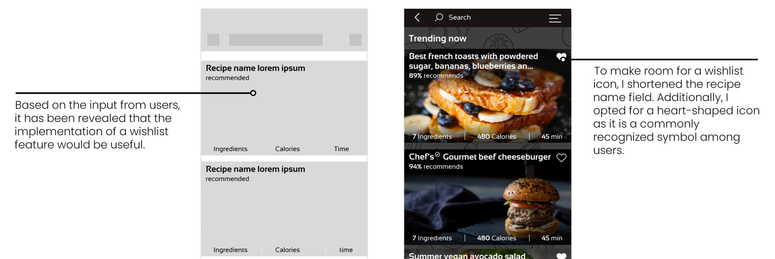
After receiving feedback on the initial sketches, the next step was to create wireframes, which offered a more comprehensive representation of the app's layout and functionality. This helped refine the design even further, ensuring that it was optimal before proceeding to higher fidelity prototypes.
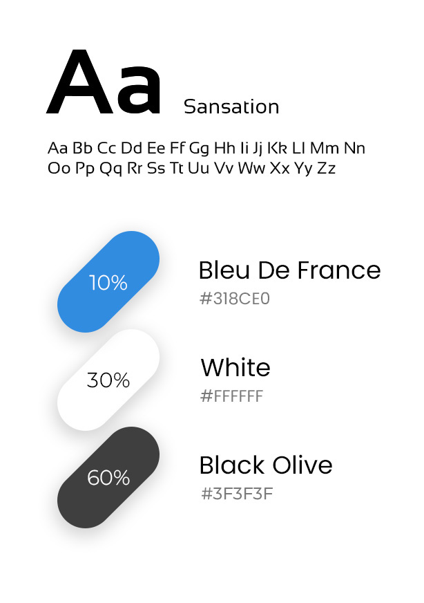
Font & colors
Once the wireframes have been finalized, it's essential to infuse the design with personality and character. The selection of a suitable color palette plays a crucial role in creating a specific mood that aligns with the brand's values and objectives, while the font choice can significantly impact readability and accessibility.
User Testing
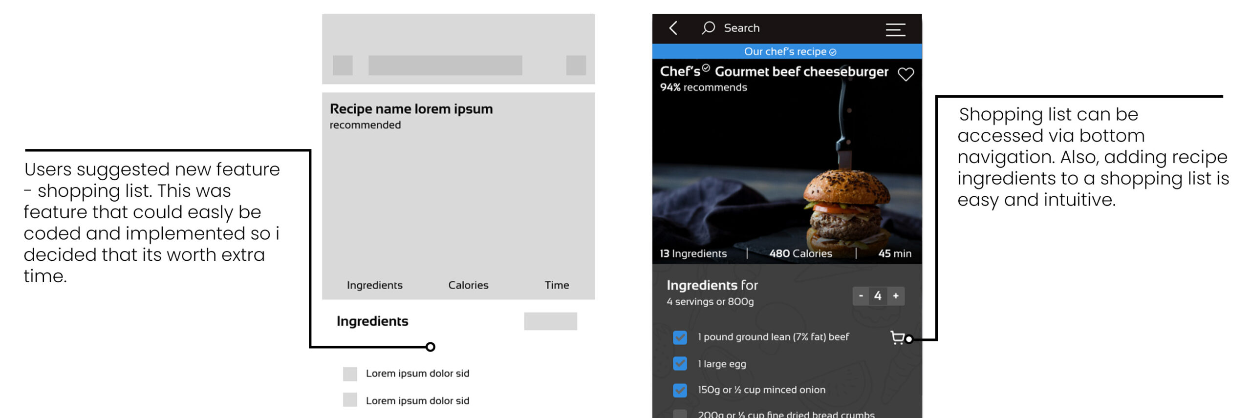
I conducted usability tests with users to validate the wireframes and make design changes based on user feedback.
Final Design
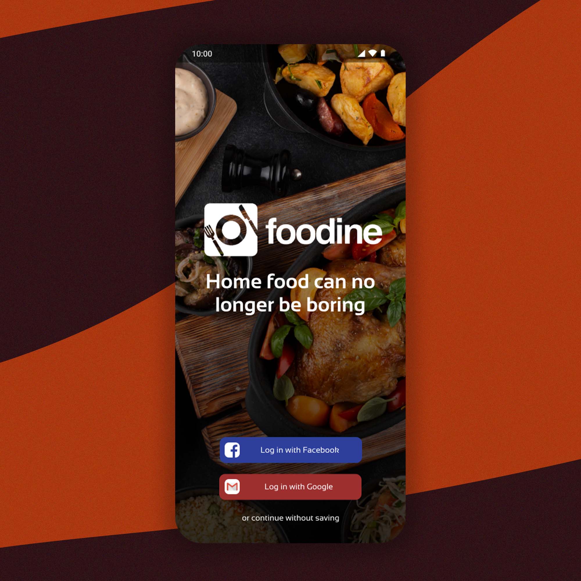
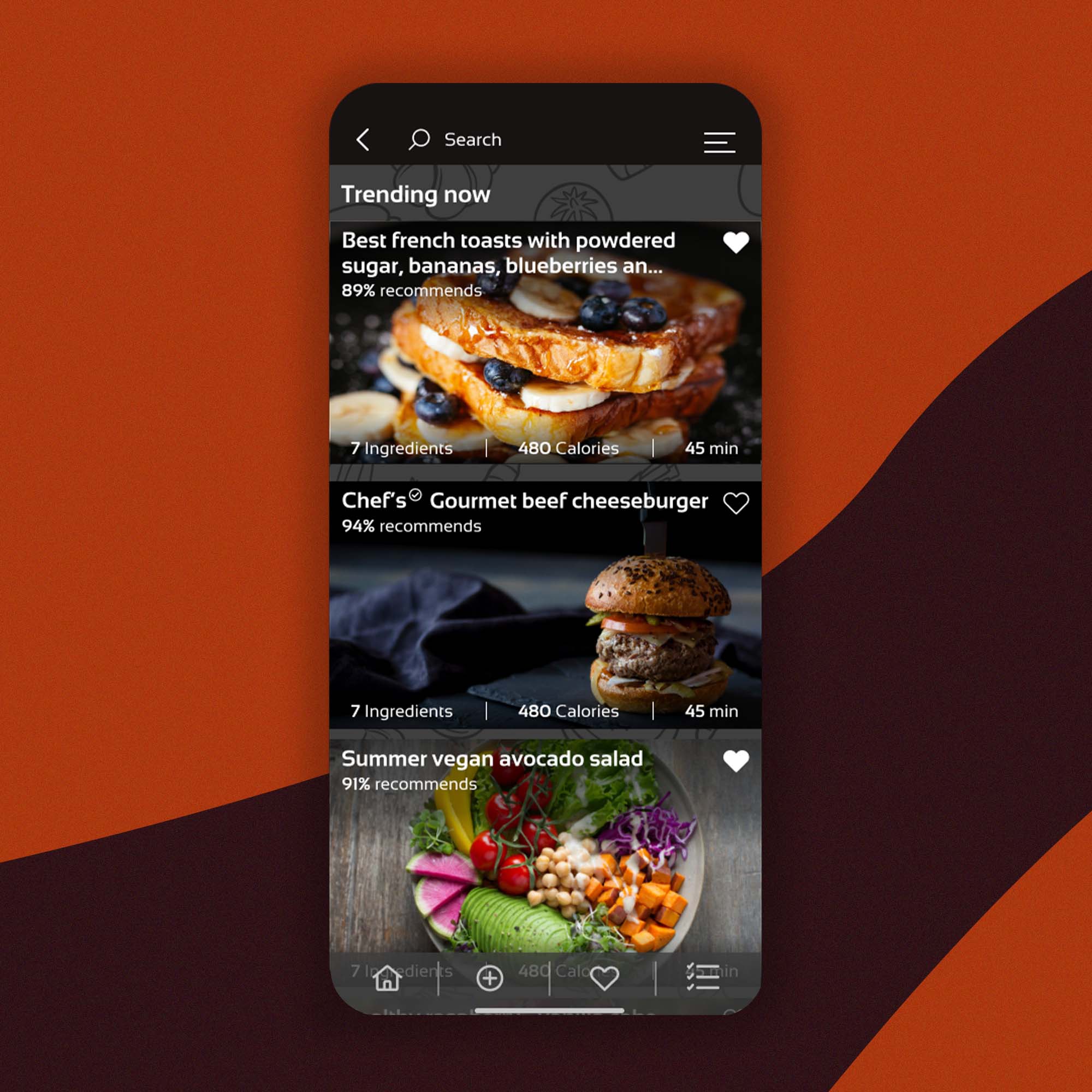
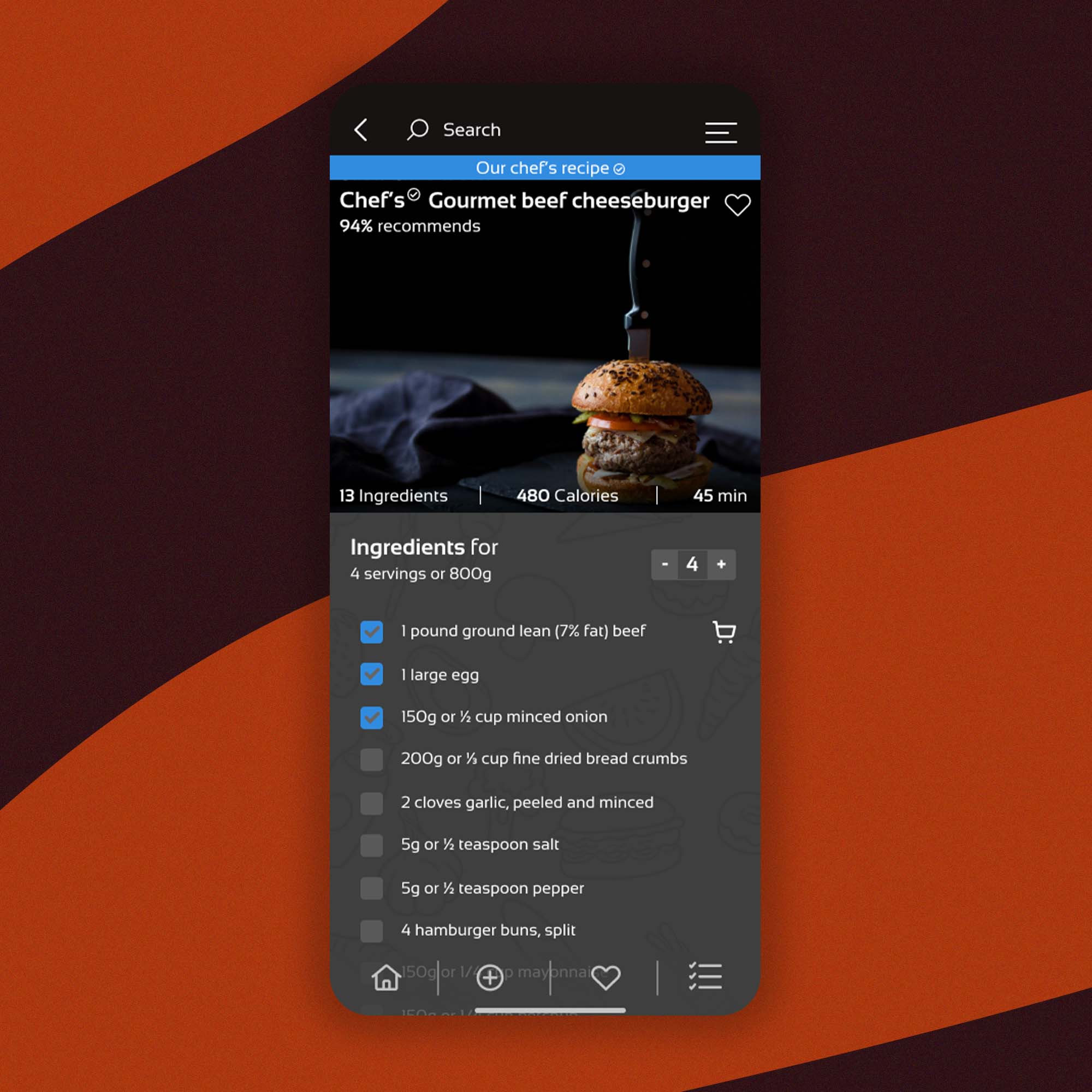
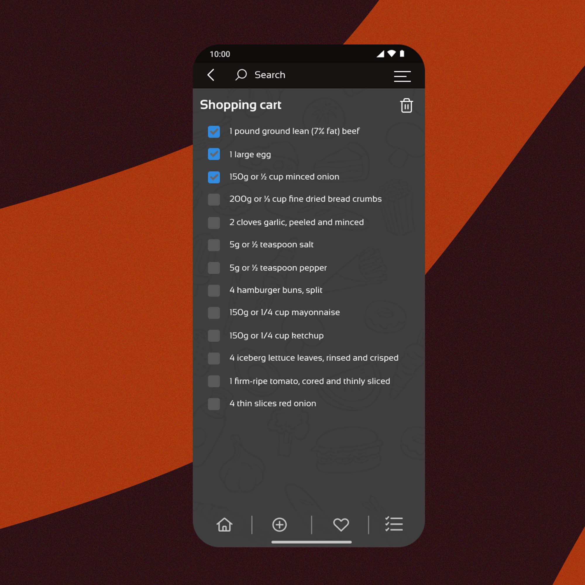
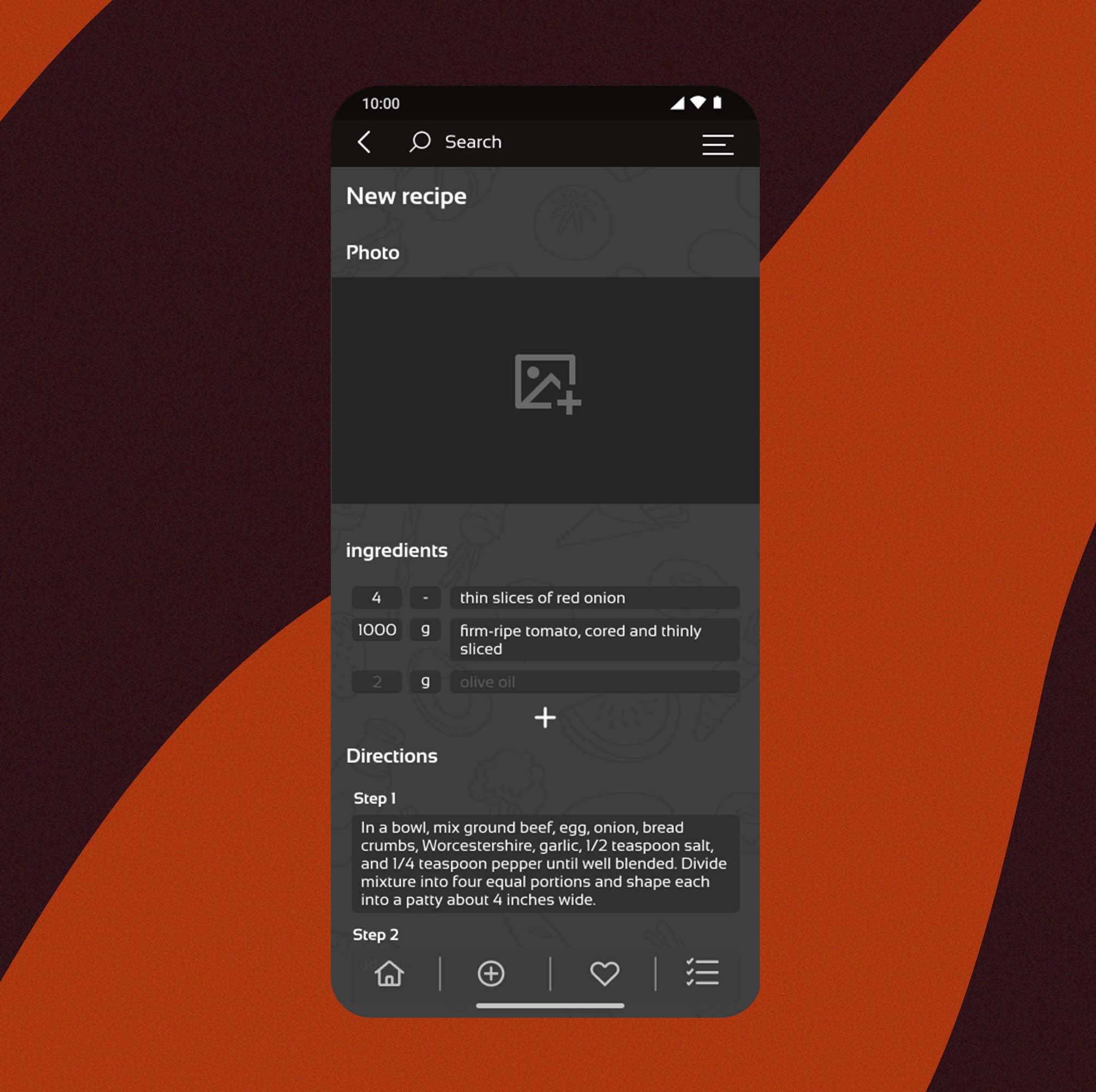
The final design of the cooking app was well-received by users, as it met their needs and addressed pain-points identified through user research. The app’s ingredient-based recipe finder and ingredient tracker were particularly popular among users, as they enabled them to make use of ingredients they already had on hand, saving time and reducing food waste.
The design was also praised for its clean and modern aesthetic, which made it easy to use and visually appealing. Users appreciated the simple and easy-to-understand navigation.
