• bold
  • brave
  • iconic
  • simple
  • louder
Loaded
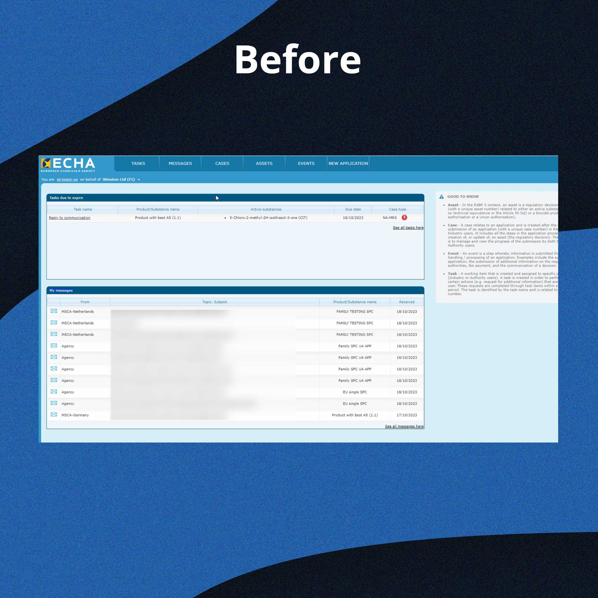
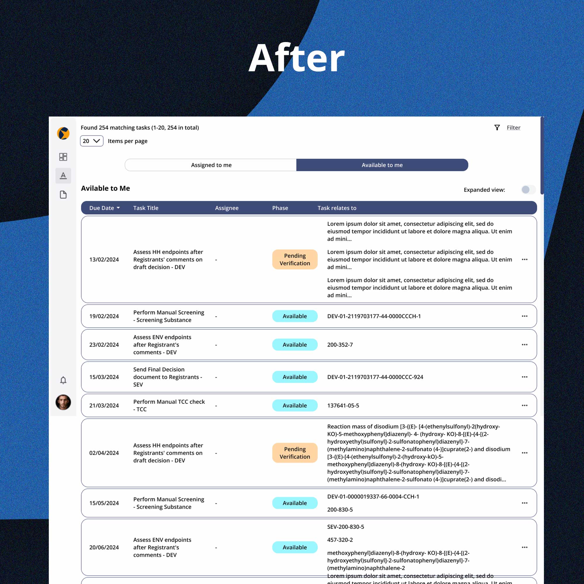
2023-2024Website redesign
ECHA - European Chemicals Agency

Type

Comprehensive UX/UI project aimed at integrating multiple small modules into a unified, central hub. The project included thorough user research, interface design, creation of wireframes, as well as prototypes.

Team

2 UX/UI Designers, a Business Analyst, and a Project Manager

Responsibilites

  • Designing the interface of the central hub
  • Conducting in-depth user research
  • Creating wireframes and prototypes
  • Close collaboration with business analysts and other UX designers


Project Summary

This case study details the creation of a central hub for the European Chemicals Agency, consolidating various modules to optimize user experience. The project emphasizes seamless navigation and intuitive design to facilitate efficient access to critical information and tools. Through rigorous user research, wireframing, and prototyping.

Problem

Numerous small modules created a fragmented user experience, hindering efficiency and user satisfaction.

Solution

We planned a central hub that integrates all modules, featuring a task list and an open task view to maintain user focus on tasks while displaying necessary information simultaneously.

Research

Understanding
the user

  • I conducted extensive surveys and interviews to understand user needs and define business requirements.

  • Given the agency’s size and the number of employees, I was excited to use surveys to support the design process.

  • Individual and group interviews (focus groups) allowed me to gain deeper insights into specific user issues, their goals, and how they interact with current systems.


Maping user
journeys

  • We created user journey maps for most common scenarios to identify key pain points that users may encounter.

  • These maps helped us understand the context in which users interact with the system, which was crucial in designing a more intuitive and cohesive interface.


Research
findings

  • 47% of users had difficulty finding necessary data in the system, suggesting the need to enhance the search and filtering capabilities.
  • 53% of users found the system navigation complex and overwhelming, prompting a redesign to simplify the layout and increase interface intuitiveness.
  • 76% of users reported that task management processes were overly complex and time-consuming, indicating a need for optimization.
  • Competitive solutions employed clear visual cues to help users locate information more quickly.

Design Approach


Wireframes


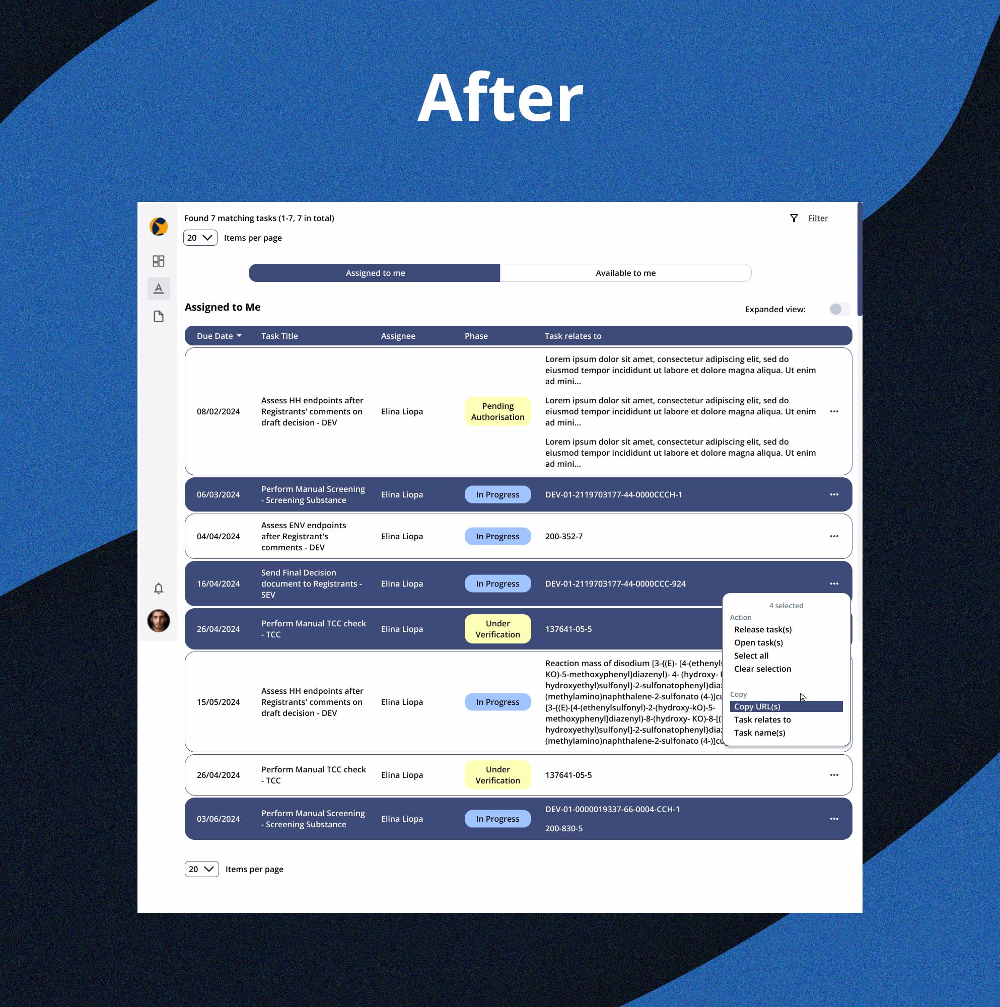
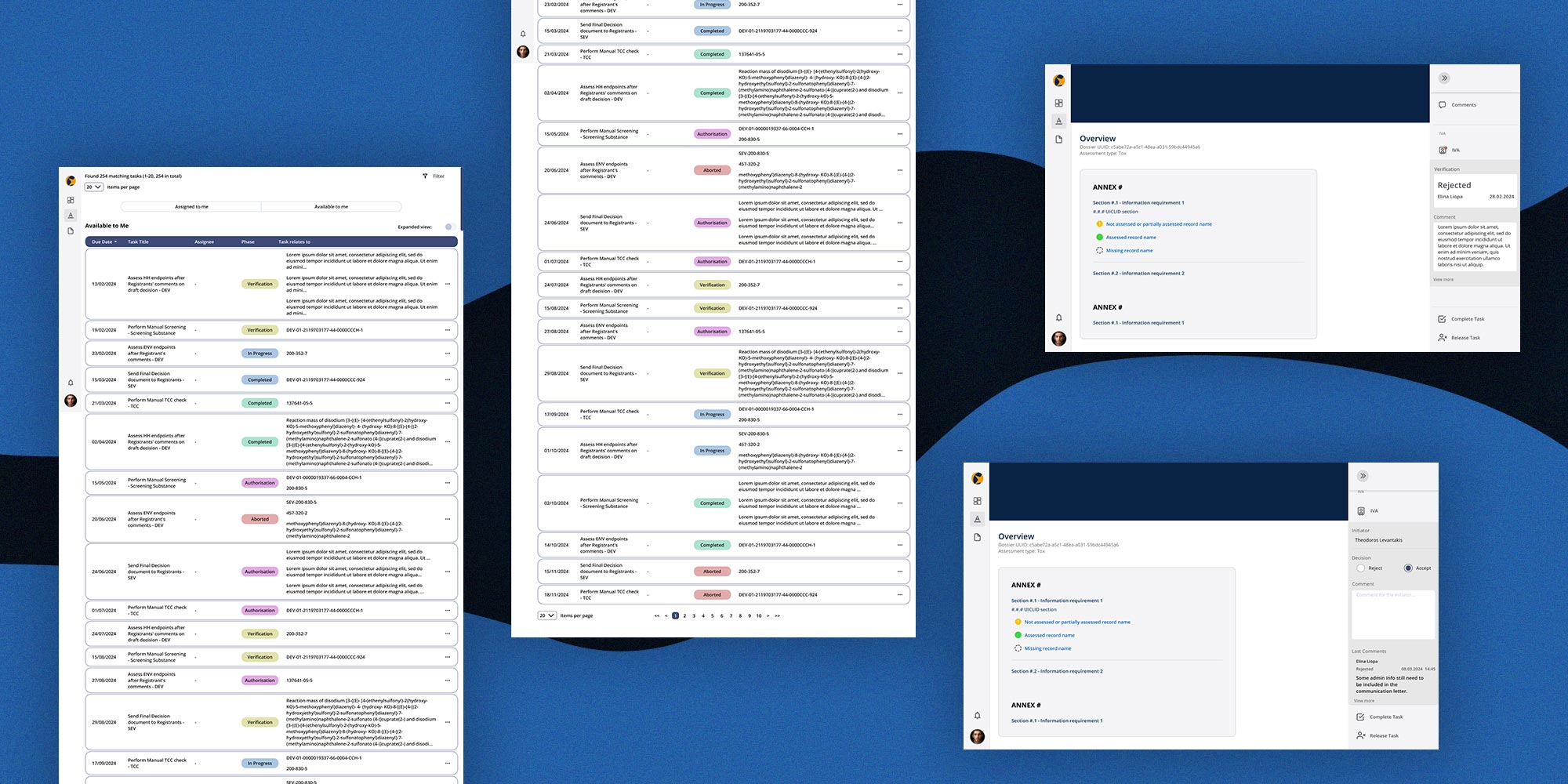
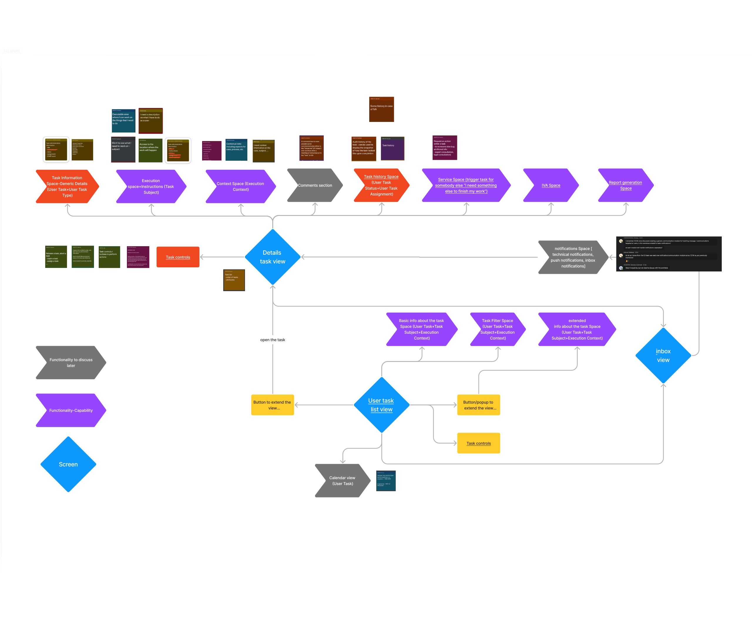
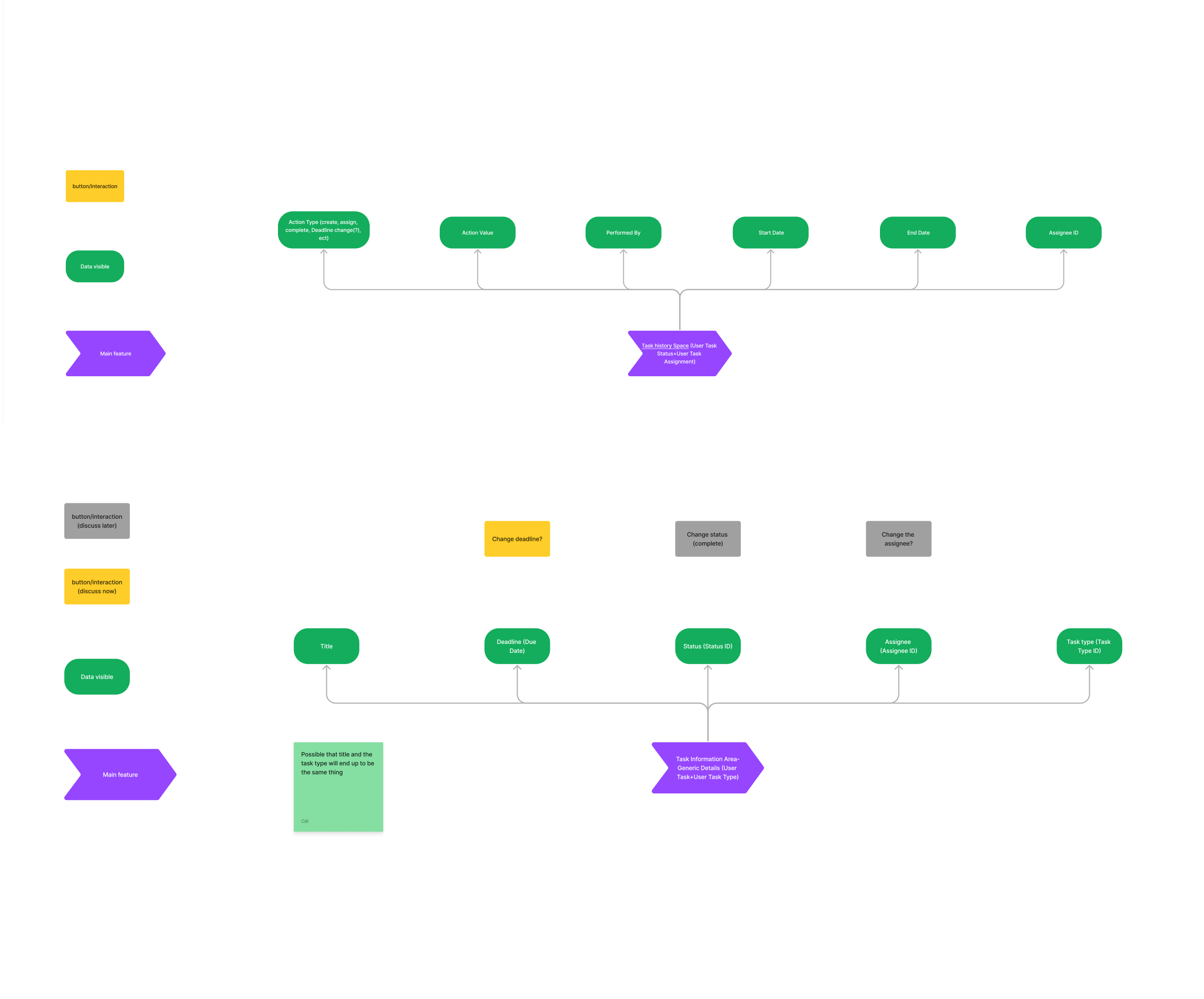
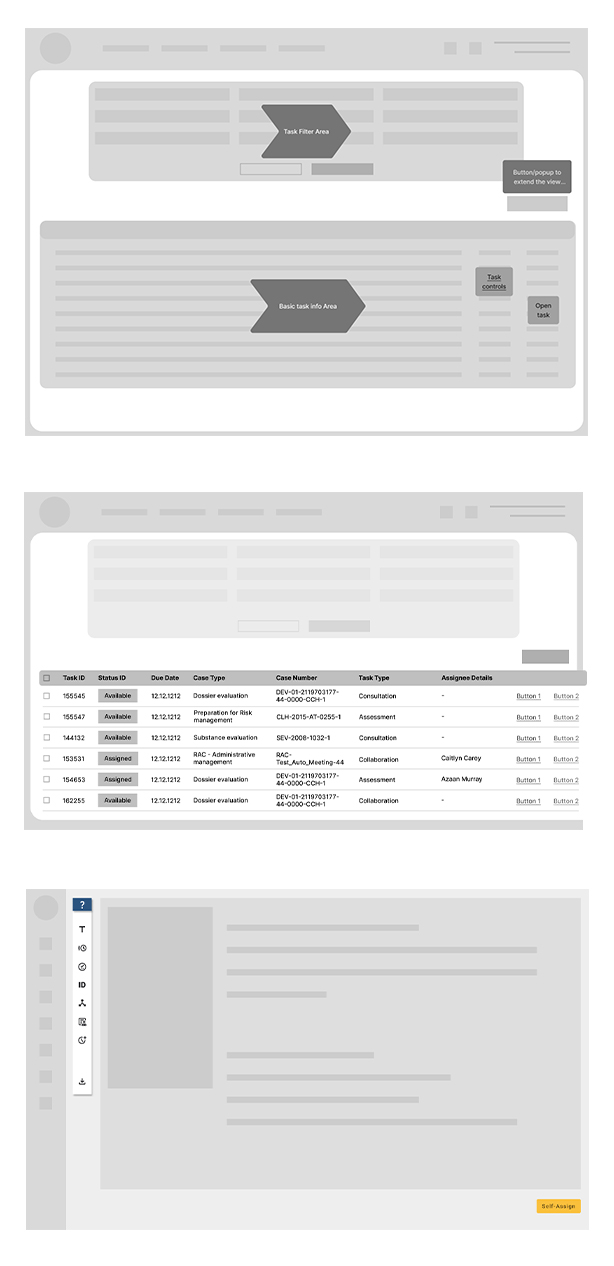
After identifying the best layout and navigation options, we created detailed wireframes to refine the design and test it with users. These wireframes helped visualize and optimize the layout of the central hub before moving on to high-fidelity prototypes. They allowed us to identify potential usability issues and make necessary adjustments early in the process.
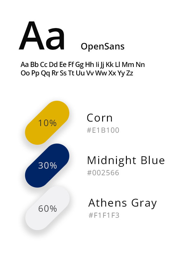

Font & colors


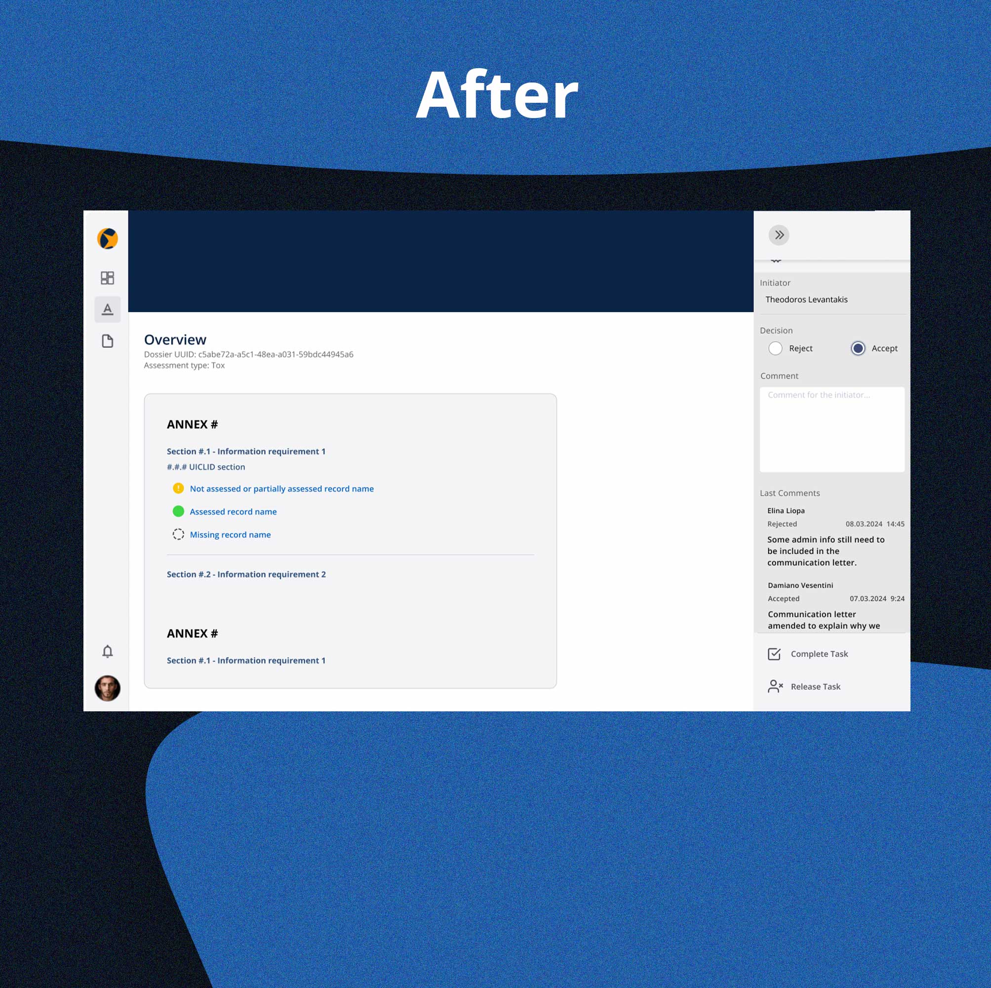
We had to adhere to brand guidelines requiring the use of midnight blue and corn yellow colors.

Despite these predefined colors and fonts, integrating them harmoniously posed a significant challenge. We strategically placed accent colors to ensure visual consistency while prioritizing accessibility and readability of all information.

User Testing

We conducted a series of usability tests on prototypes to identify and address any project issues. Users were engaged in various scenarios, allowing us to thoroughly examine their experiences. Based on user feedback, we implemented the following changes:

Final Design

Despite its rough, prototype stage, most users were satisfied with the new version of the website. We were pleased to see a 30% increase in the utilization of key system functions, as well as a reduction in the user path to the most popular tools and flows. This directly contributed to an increase in employee productivity.

2022-2023Website redesign
Inwentury - Become stocktaker