Type
Design of the payment management system for Polish travel agency – Rainbow.
Team
Two UX/UI Designers and a project manager.
Responsibilities
We were responsible for designing the interface of the new system, conducting user research and iterating the design.
Project Summary
Problem
Rainbow had an outdated internal system that was not user-friendly and had a lot of usability issues. Employees had to manually perform many tasks, and worst of all remembering a lot of critical data, leading to inefficiencies, errors, and a lot of time and money wasted.
Solution
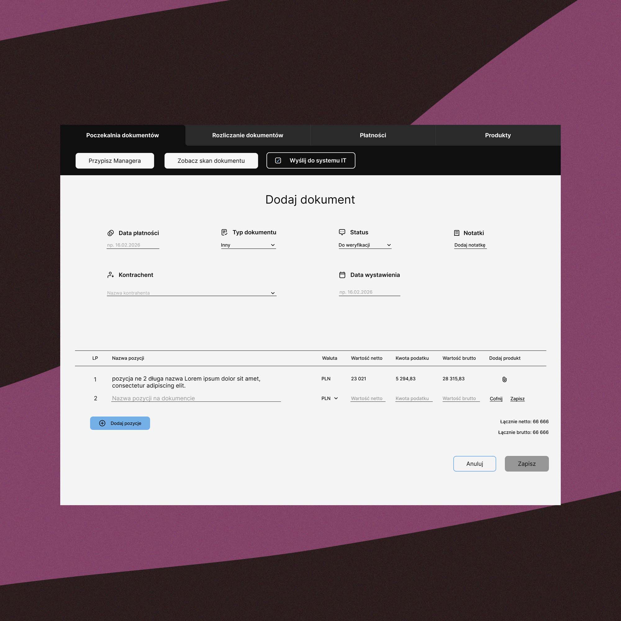
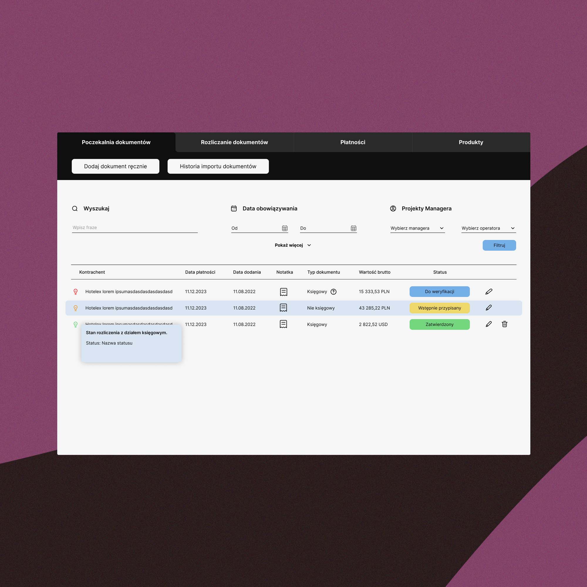
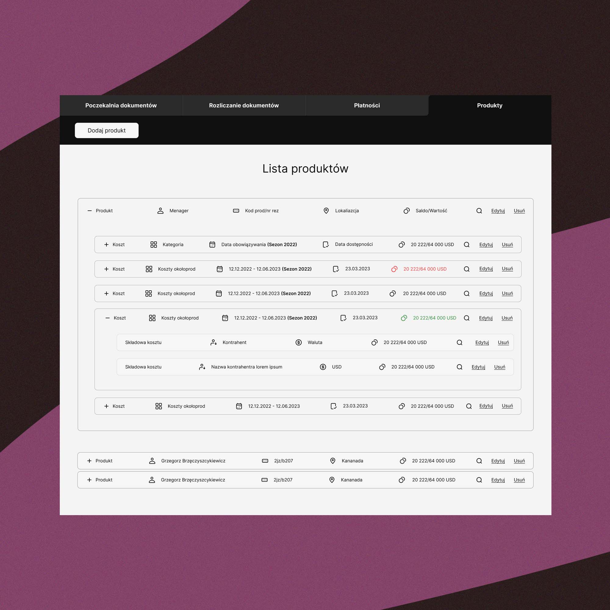
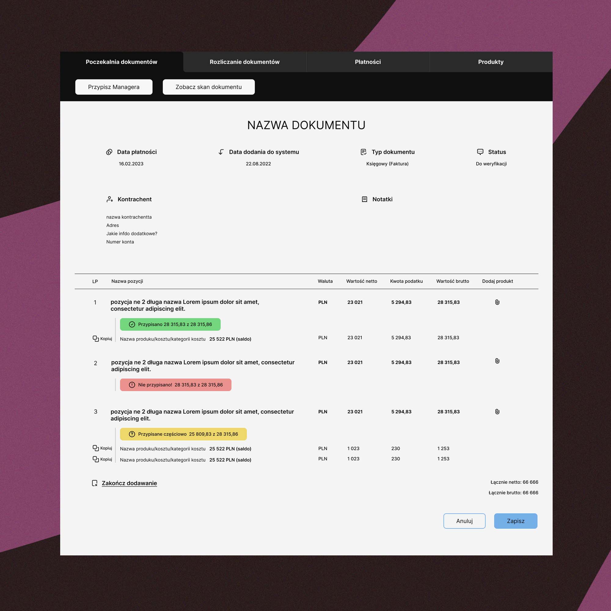
The solution was to redesign the internal system with a modern, intuitive, and efficient interface, with features that would automate most of the tasks and reduce the workload of the employees. The redesign would help shorten the payment process for hotels, flights, and other travel-related expenses.
Research
Understanding
the user
During the interviews, I asked open-ended questions to understand current workflows and any challenges they encountered when performing tasks. I also observed their interactions with the current system and asked follow-up questions to clarify their responses.
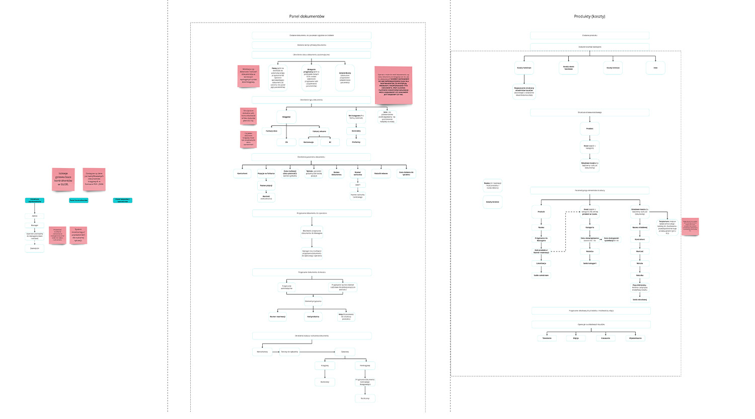
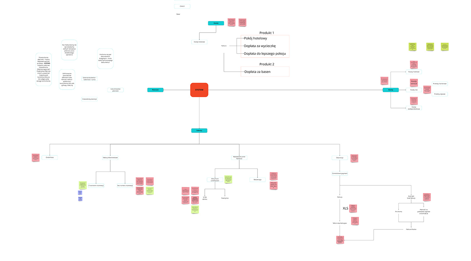
Once the interviews were completed, we analyzed the data with PM to identify patterns and themes. Based on the findings, we proposed ideal user flow diagram that address the issues and needs identified by the interviews.
Key
insights
- Simplifying the interface: We needed to reduce the number of screens and the amount of information on each screen, making the system easier to navigate and use.
- Adding more automation: Research showed that we can automate most of the repetitive and time-consuming tasks, such as filling out forms, to reduce the workload of the employees.
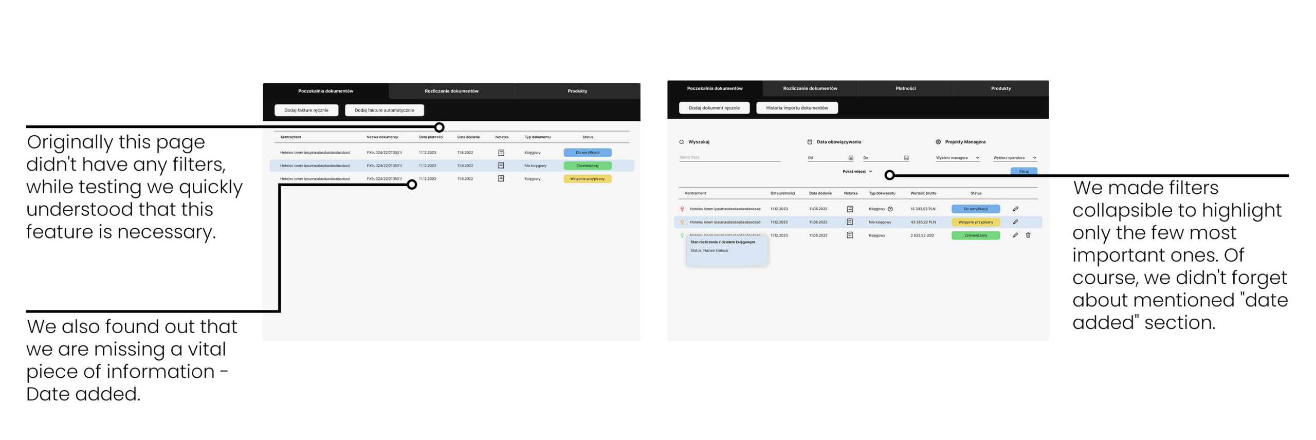
- Improving the search function: We wanted to improve the search function to make it faster and more accurate, Adding additional filters will allow employees to find the information they need quickly, easily and will help to avoid flooding user with useless information.
Design Approach
Font & colors
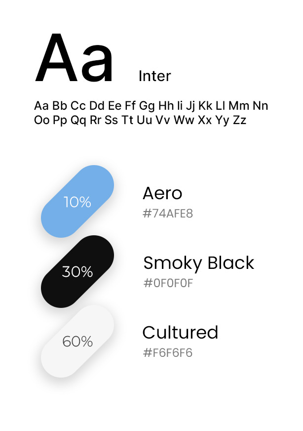
After careful consideration, we selected the elements that we believed would work best together. The colors, typography, and imagery all had to be aligned with the project objectives. By taking the time to make these choices, I'm confident that the final product will meet and exceed expectations.
User Testing
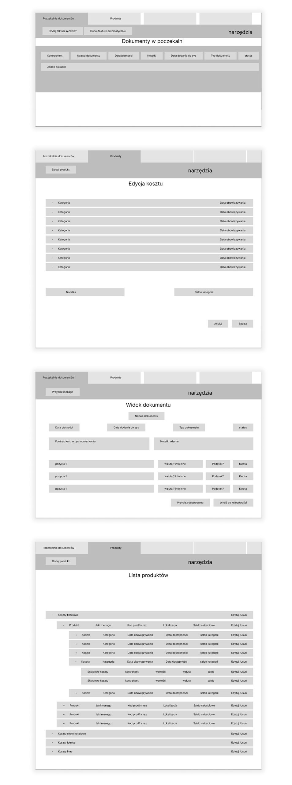
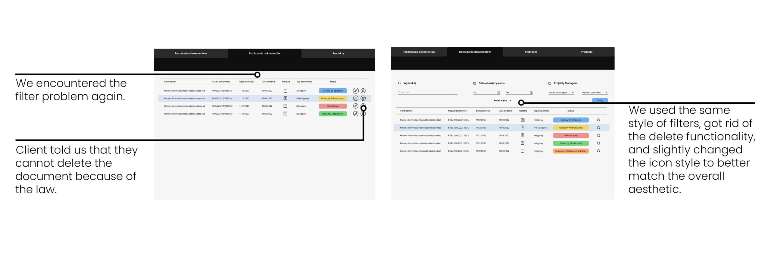
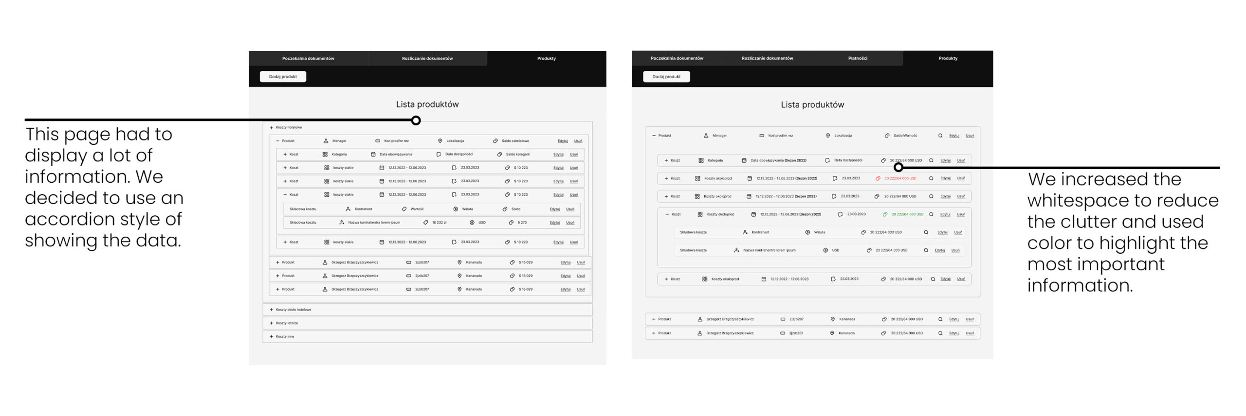
We conducted usability testing with employees of the travel agency to get feedback on the wireframes. We used the feedback to make several changes to the design such as:
Final Design
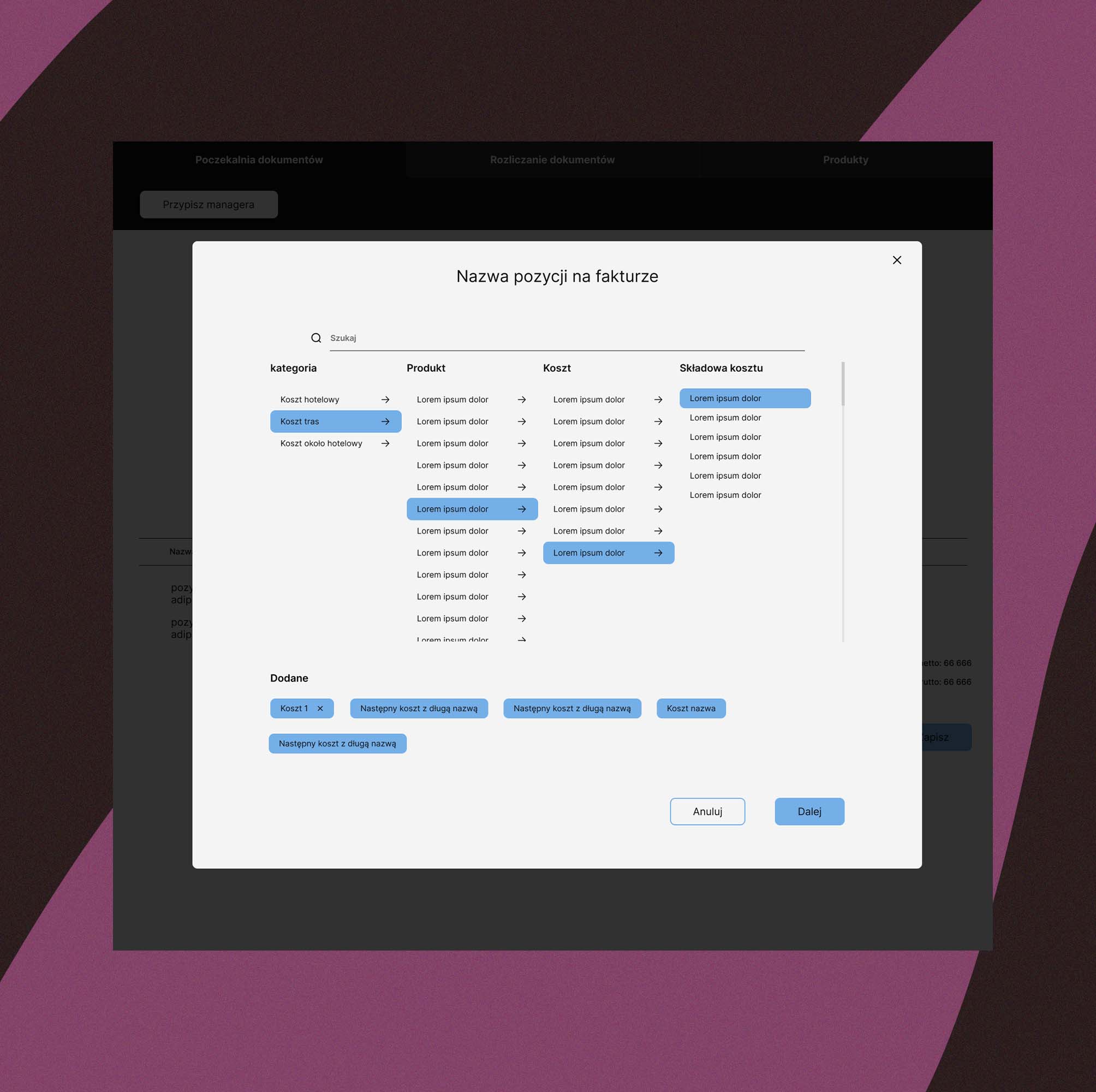
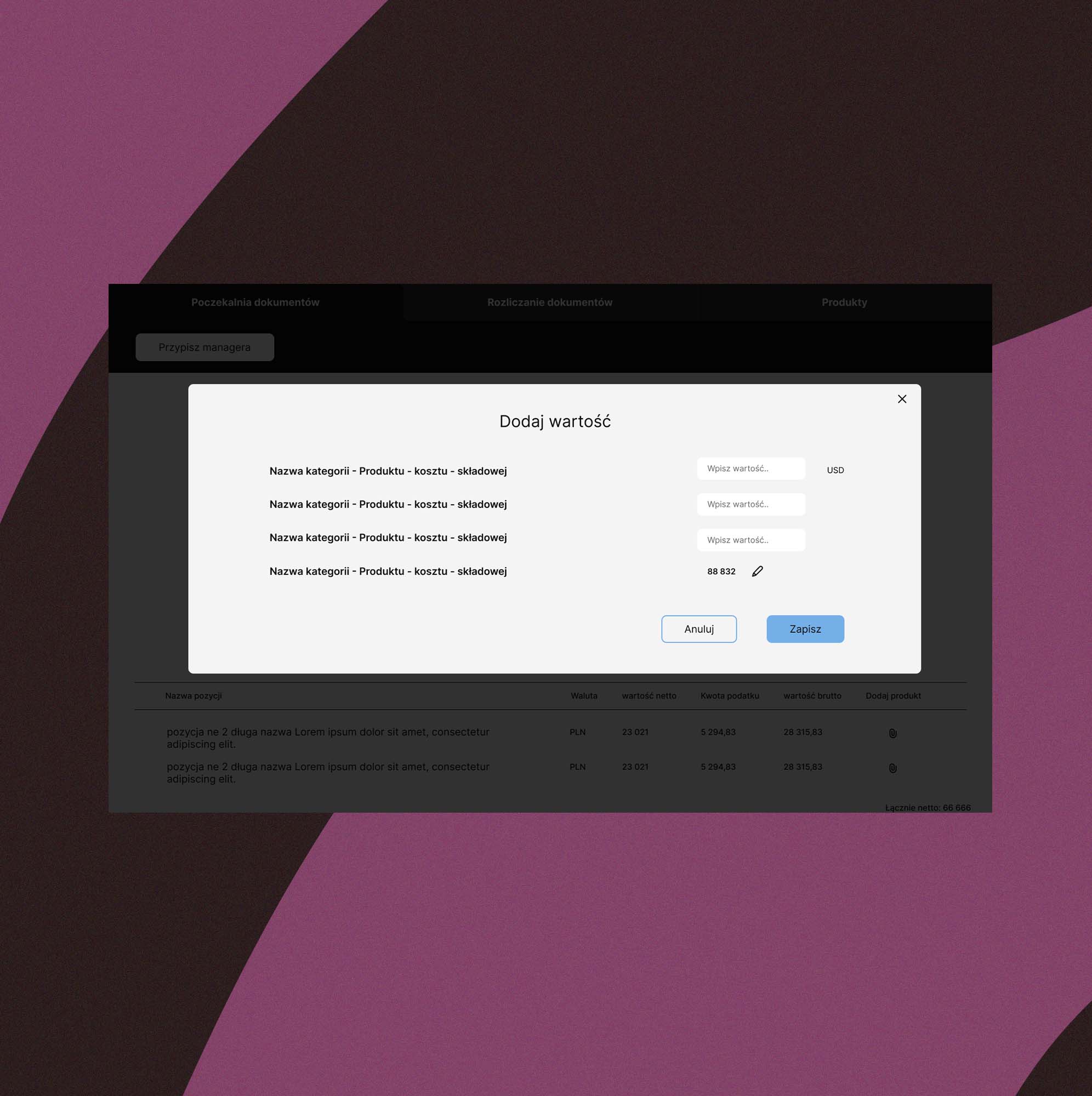
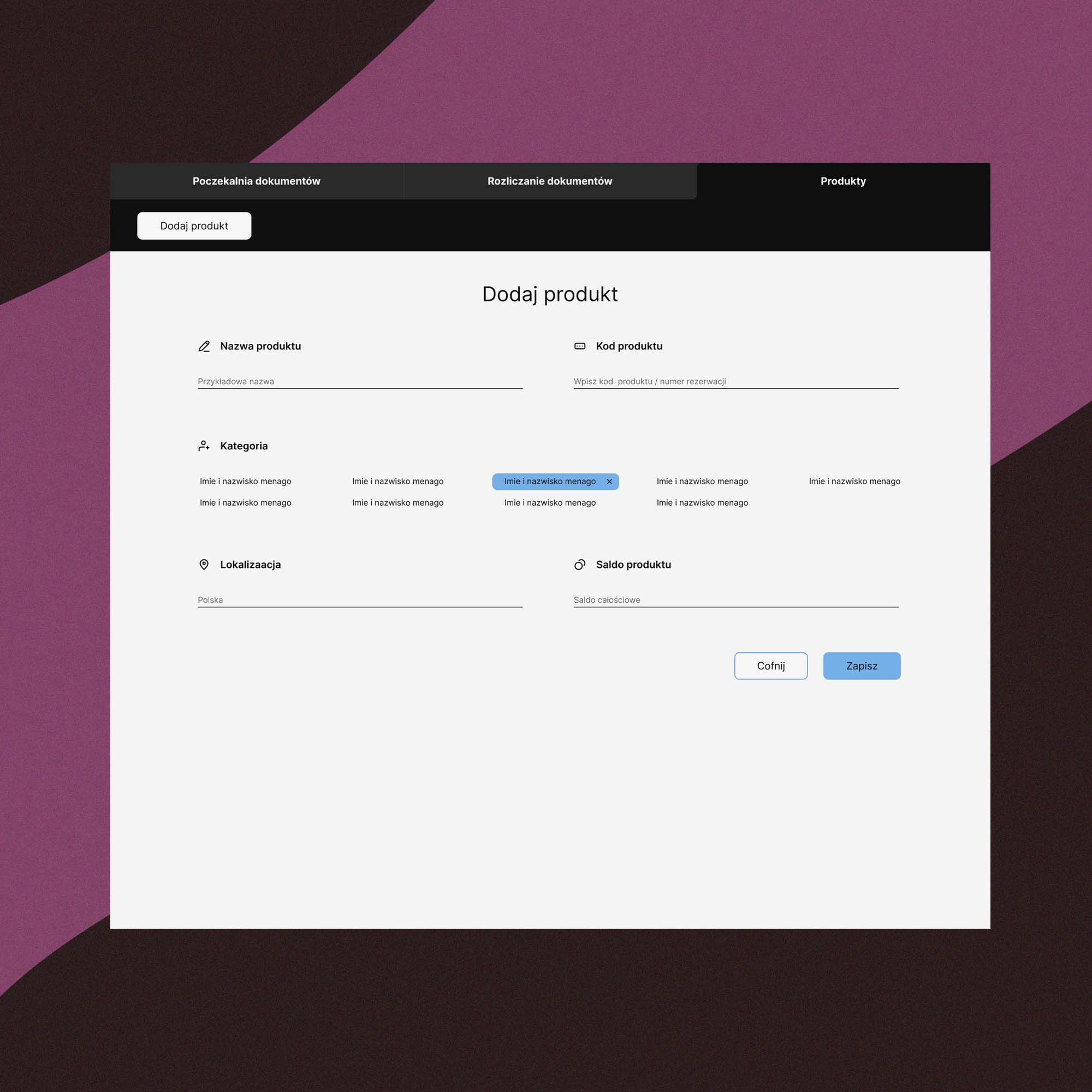
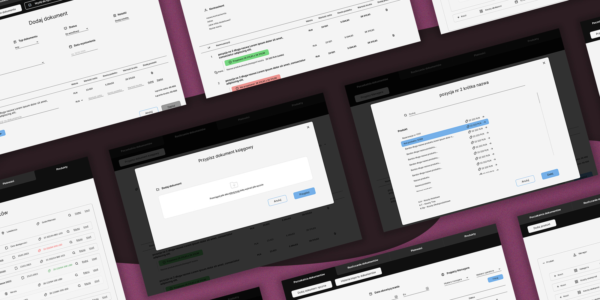
The final design was a modern and intuitive system that had automated all possible tasks, making the payment process faster and more efficient. The stakeholders were very happy with the new design that could potentially save thousands of dollars just by leading to increased productivity and efficiency. The employees were also satisfied with the new system, love how hyped they were at the reveal of the final design.
