• bold
  • brave
  • iconic
  • simple
  • louder
Loaded
2022Website redesign
Decathlon - Summer edition
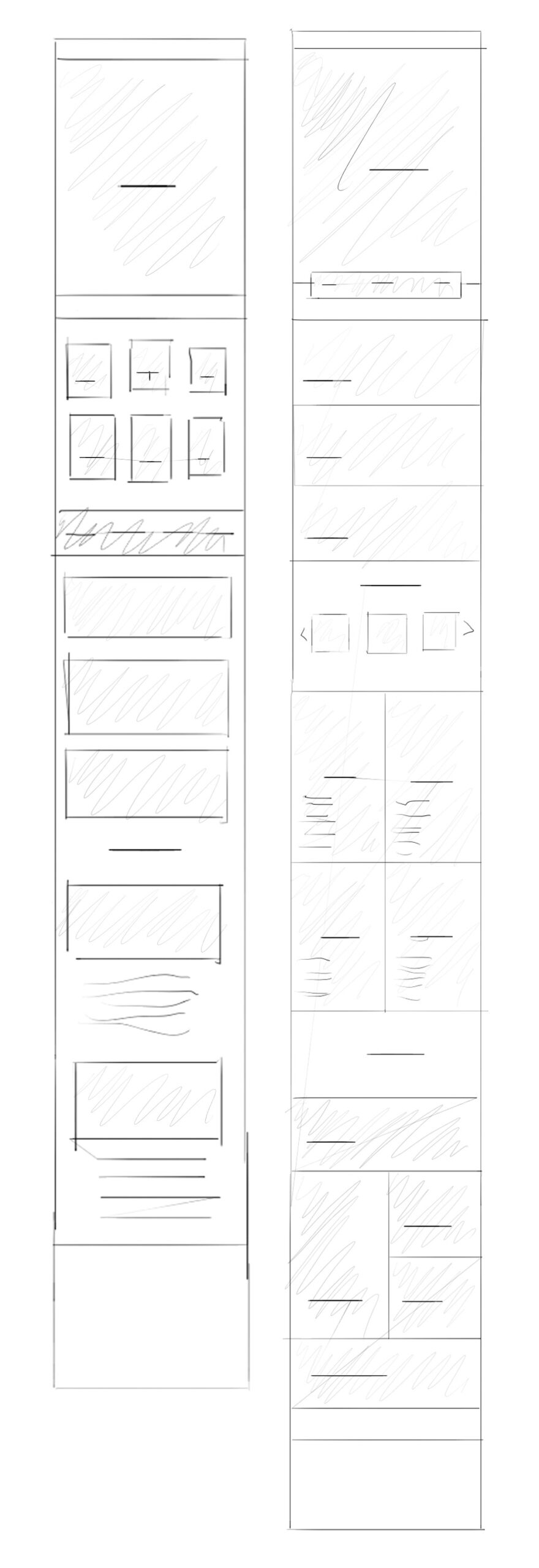
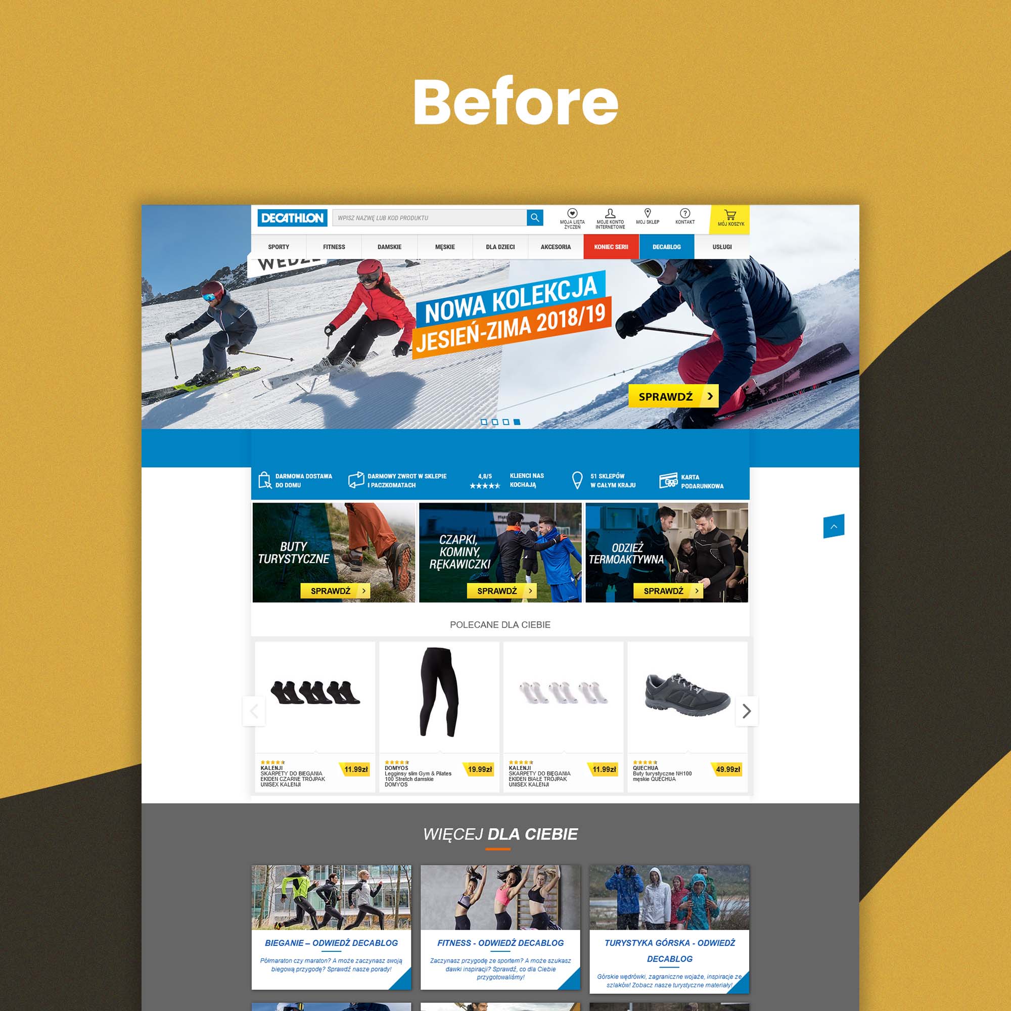
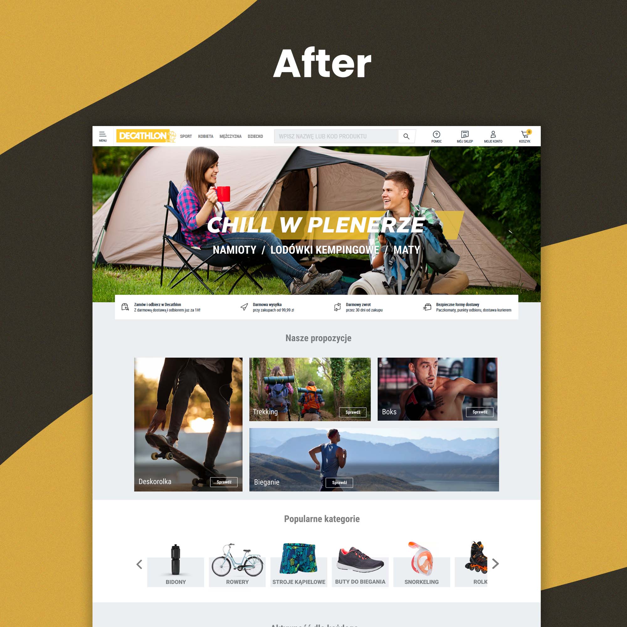
Type

Landing page redesign for Polish branch of Decathlon

Team

The project team consisted of a UX/UI designer (myself), and a senior UX/UI designer

Responsibilites

As the UX/UI designer, I had to work under a tight timeline and check new design live

Project summary

Problem

Decathlon’s landing page had to be updated for the summer season, the existing design was outdated and did not effectively showcase the most popular sports of the summer. The page needed a redesign that would not only appeal to users but also meet tight deadline and highlight the most profitable products.

Solution

The solution was to create a new landing page with a fresh design, featuring high-quality images and clear calls to action that would encourage users to explore and make purchases

Constrains

The project was under a strict deadline and Decathlon preferred to test designs directly on their website rather than on mockups.

Design Approach


Sketches


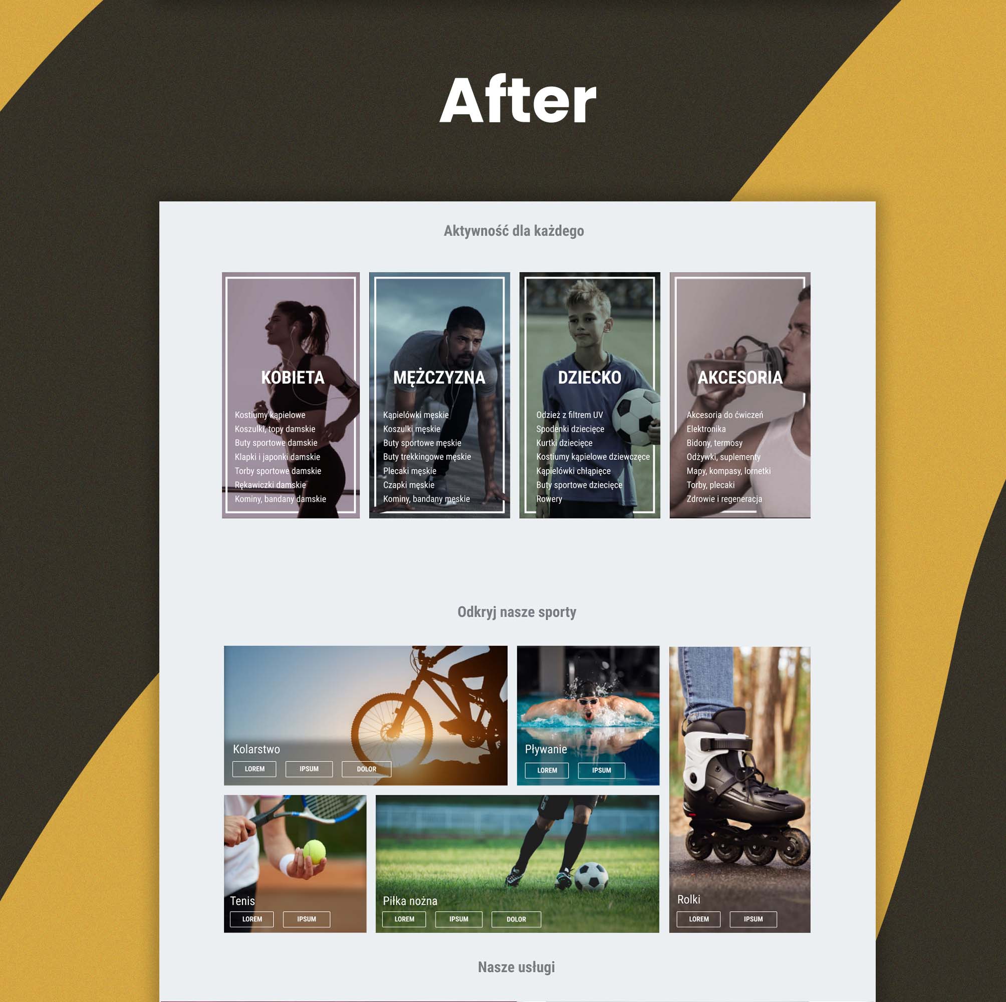
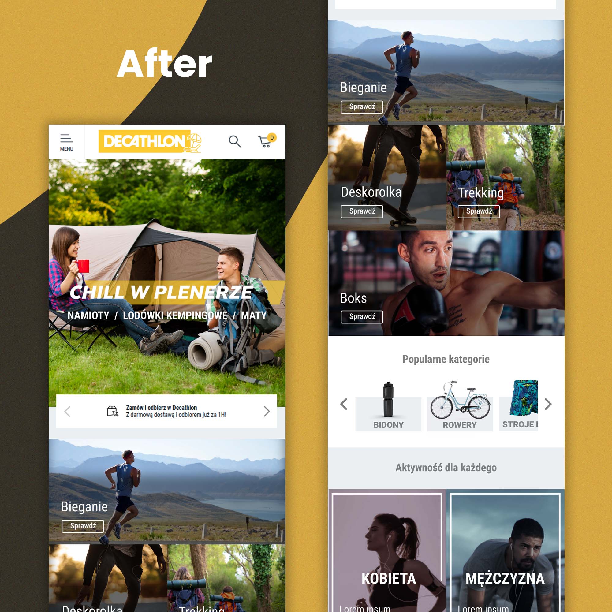
Based on data we got, we developed initial sketches of the landing page that focused on highlighting the most popular sports of the summer and making it easy for users to find and purchase products related to those sports.
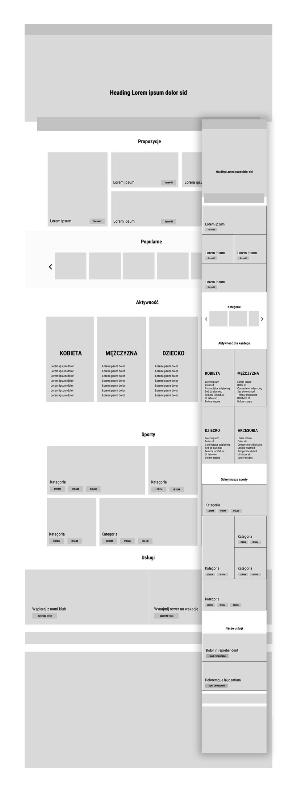
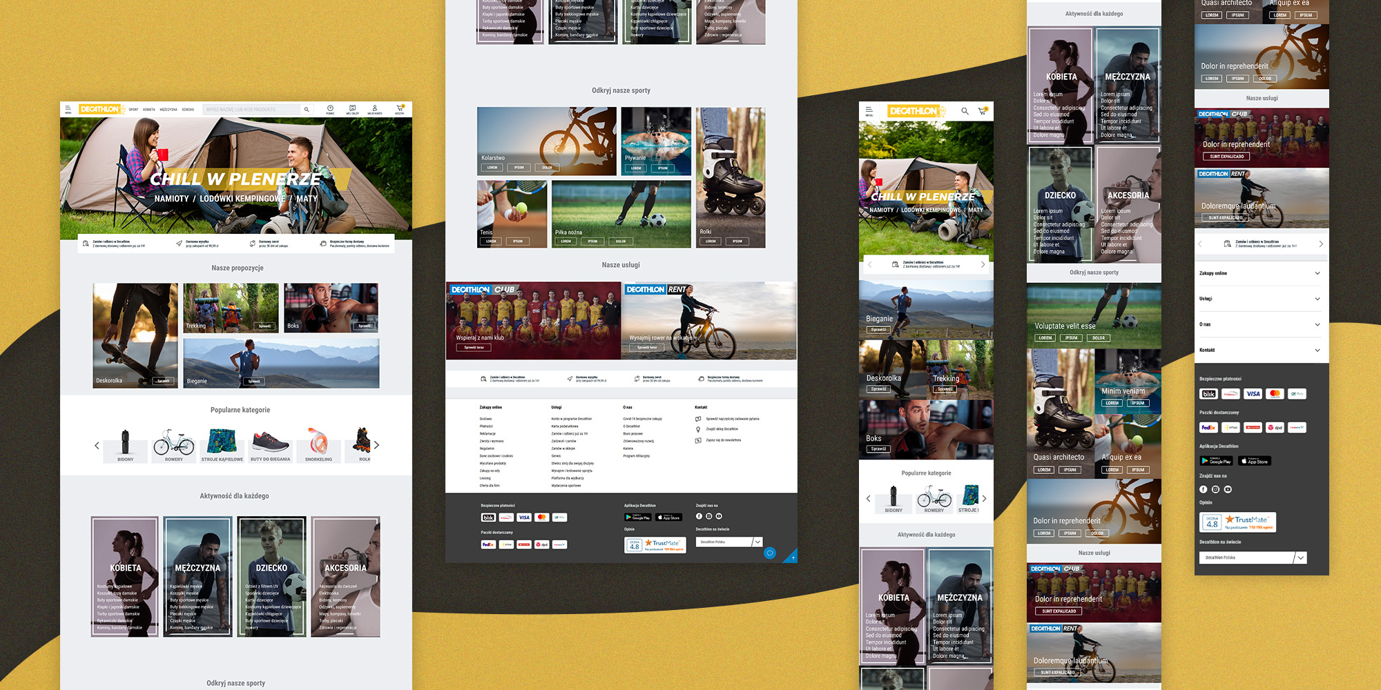

Wireframes


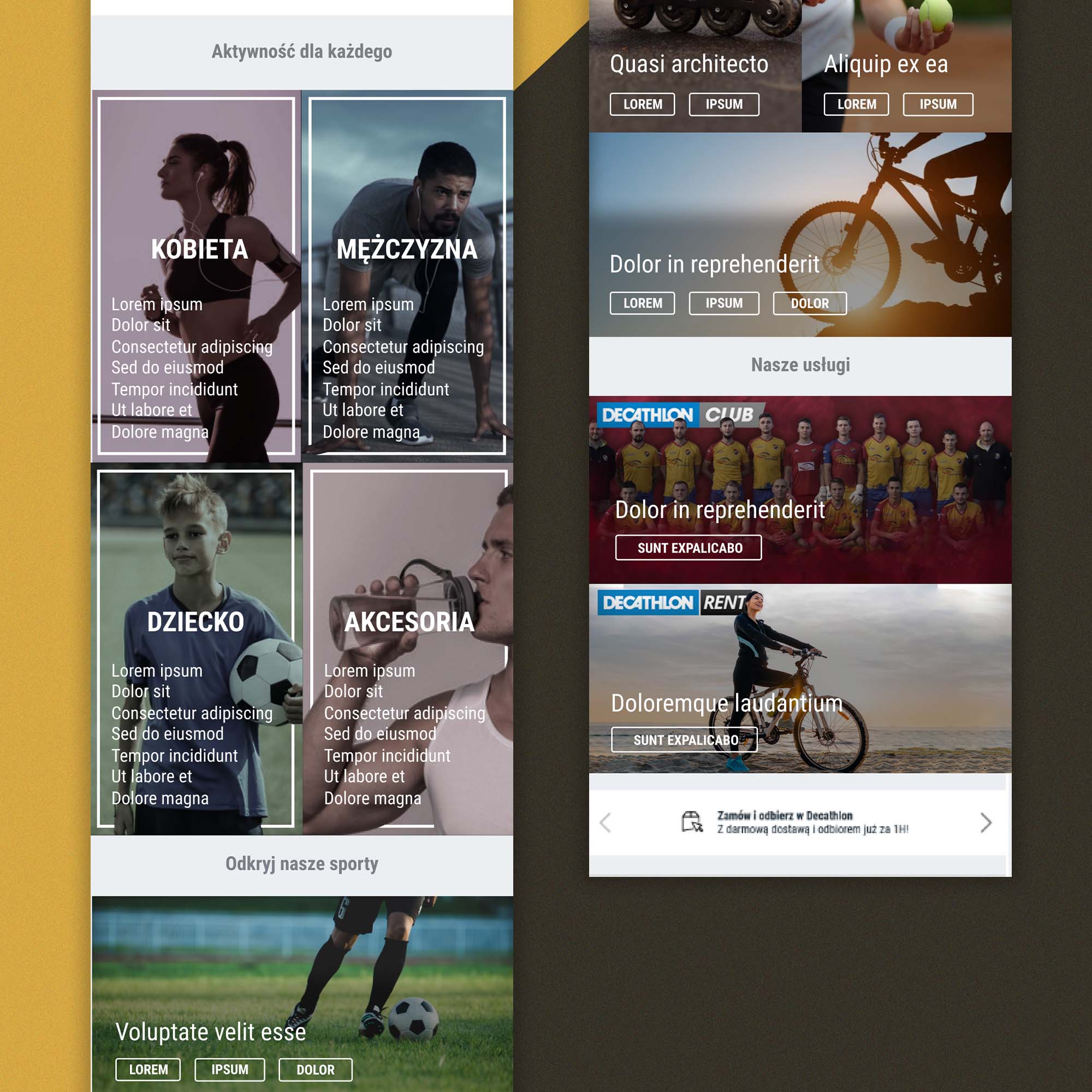
We developed wireframes of the new landing page based on the initial sketches and iterated on them until we arrived at a design that met senior UX/UI designer expectations, and user needs. The final design highlights what users are looking for.

Final Design

The final design was well-received by the users and resulted in increased conversion and sales. Despite the lack of time, the design was successful in achieving the project’s goals.

2023Software
Rainbow - The travel agency